Data-Based Assessment

Proprietary assessment tools and processes to help manage organizational transformation.

This logo represents the Data-Based Assessment service. It consists of the letters ‘DBA’ centered within a solid blue circle.
A person with light skin holds up a tablet, capturing a live event where a group of people are speaking in front of an audience. The tablet screen shows a pie chart and the speakers, who are blurred in the background of the image. The setting suggests a conference or presentation, with attendees seated and focused on the speakers. The image on the tablet provides a clearer view of the ongoing presentation.
A large group of people with varying skin tones are gathered in a spacious room, engaging in different activities such as discussions and collaborative work. The room has a large projection screen displaying sticky notes with one prominently labeled ‘Emotionally attracted to.’ Several small groups are seated in folding chairs, deeply involved in their tasks, while others stand and converse around the room. The atmosphere suggests a workshop or conference setting focused on teamwork and interaction.

Our Data-Based Assessment service is frequently requested as a follow-up to the Learning Lab, but can also be used alone or in combination with what you’re already using.

Please contact us to determine what would work best for you.

Our proprietary assessment offering is comprised of three linked services:

Our Data-Based Assessment service is frequently requested as a follow-up to the Learning Lab, but can also be used alone or in combination with what you’re already using.

Please contact us to determine what would work best for you.

Tools

Tools to collect and share relevant data in real time so you’re never in the dark

A graphical representation of a smartphone screen over a solid blue circle background. The smartphone screen displays various progress bars and ratings, while pop-ups ask for feedback on a person's collaboration skills, with an option to rate between 1 and 5 stars. Another message confirms the completion of a goal related to defining and implementing engagement metrics. The design uses a blue and white color scheme, with circular profile images, creating a user-friendly and professional visual experience focused on performance and teamwork.

Data Tools: Fast Feedback, Delivered Confidentially

Transforming your organization into one that’s committed to racial, cultural, and gender equity requires reliable, real-time data on employee sentiment and the impact of change management policies.

Our assessment platform enables this by providing an inclusive system where every person within your organization can trust that their feedback is collected in complete confidence, and that it will be seen by the appropriate people.

Features

  • Collect confidential, real-time feedback from your team, as often as you like.
  • Identify trends and set benchmarks.
  • Be alerted to “hot spots” or other issues so stakeholders can take immediate actions.
  • Support your organization’s transformation plan with helpful guidance that’s custom-generated from a robust content library.

Dashboard

A powerful dashboard that’s fully accessible and easily customizable

The Dashboard: Clear, Customizable, and Current

The customizable dashboard synthesizes your collected data and displays it in clear, easy to read visualizations, so that you can immediately gain insights and make decisions.

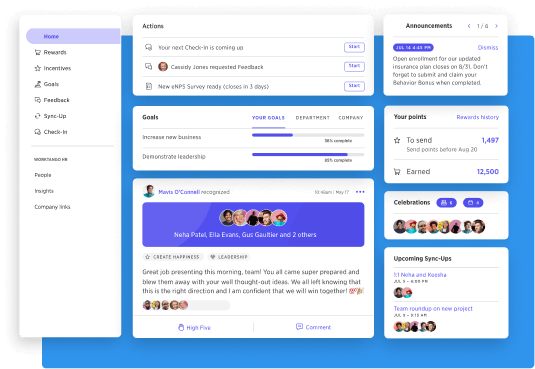
This image showcases a visual representation of a digital dashboard used for performance management and collaboration tracking. The layout includes sections for rewards, incentives, goals, feedback, and check-ins, with various user profiles and progress updates visible. There is a smartphone screen displaying similar data for mobile access. A table in the foreground presents a heat map, likely analyzing metrics like leadership, discipline, and culture. The design uses a clean interface with blue, white, and purple colors, emphasizing data-driven performance insights.
This image displays a digital interface for employee performance and collaboration tracking. It features a sidebar menu with options like Rewards, Incentives, Goals, and Feedback. The main content includes sections for upcoming actions, personal goals, announcements, points earned, and upcoming sync-ups. Additionally, it highlights recognitions, showing appreciation messages from team members. The design uses a white and blue color scheme, with various widgets for task management, celebrations, and progress tracking, aiming to foster engagement and productivity within a team.

Data Storytelling

A humanized approach to sharing data that sparks collaboration and buy-in

The image shows a group of people collaborating, sitting around a table, working with pens and papers. Above this scene is a set of graphical elements displaying employee engagement metrics. The bar charts show percentages for factors like employee engagement, inclusive leadership, and goal alignment, with color-coded segments indicating unfavorable, neutral, and favorable responses. Below, there's a detailed table breaking down responses by factors such as mission and values, leadership, and alignment, using percentages and color-coded averages for easy interpretation. The image emphasizes teamwork and performance tracking.

Data Storytelling: The Secret Ingredient to Organizational Change

Every client has given us the same feedback when we work with them with the data compiled in their dashboard. Although our platform does a superb job collecting and synthesizing data, what clients respond to is the hands-on collaboration we engage in with the client to help them craft a compelling story that inspires action.

Data storytelling blends the data gathered from our assessment tools with human storytelling to build an appealing, clear narrative that everyone on your team can utilize, which leads to insights and ideas that might otherwise be missed.

Let’s do this work together!

Our Services

We can help your team transform your organization into a more human one.

Training Video
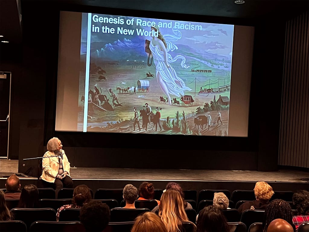
Keryl McCord sitting on a stage in front of an audience, giving a presentation. On the large screen behind her is a slide titled ‘Genesis of Race and Racism in the New World,’ featuring a historic painting of settlers traveling across a landscape with covered wagons and trains. Keryl, who has light gray hair, is seated with a microphone, and the audience is seated in rows of chairs, attentively watching the presentation. The setting appears to be a lecture hall or theater, and the overall atmosphere is academic and educational, focusing on historical themes related to race and racism.

Want to learn more?

Get a taste of the Learning Lab experience with this in-depth exploration of the origins of racism and classism, going back over 500 years.

Explore “The Genesis of Race and Racism in the New World”